
Parker Walsh
A corporate recovery firm that didn't look like one.
Parker Walsh is Molly Monks’ corporate recovery and insolvency practice. She came to me before the business had a name on a door, a website, or a single piece of collateral. What she had was a clear vision for how she wanted clients to feel when things were at their most difficult, and that turned out to be the brief.

Corporate Recovery & Insolvency
Brand Identity
Web Design
Web Development
Social Media
Brand
Build
Grow
Where we started
A sector built on fear, run almost entirely by men.
Corporate recovery is not a world that tries hard to be welcoming. The firms that dominate it tend to project the same things: sharp suits, angular logos, names that sound like law firms from 1987. The visual language of the sector says authority. It rarely says trust, and it almost never says you’re going to be okay.
Molly was launching Parker Walsh into that environment. She had the credentials and the experience. What she needed was a brand that could walk into a room full of businesses in distress and immediately feel different, not softer or less serious, but human in a way the sector generally isn’t. The kind of firm that a founder in crisis would feel relieved to call, rather than intimidated by.
The challenge was building that brand from nothing. No existing identity to evolve from, no interim assets to tide her over. We were creating the whole public face of the business from a blank page, which meant every decision mattered, there was no “we’ll fix it later.”
The decision
No scales. No gavels. No columns.
The obvious visual language for a corporate recovery or insolvency firm borrows from law: scales of justice, classical columns, serif typefaces that signal tradition and weight. It’s a shorthand that says “we are serious people who know what we’re doing.” The problem is that every firm in the sector uses the same shorthand, and when everyone signals the same thing, nobody stands out and nobody feels human.
The insight came from thinking about who the actual client is in a moment of corporate distress. Not a company, a person. Usually a founder or a director who has spent years building something, and who is now sitting across from someone they’ve never met, in the worst professional moment of their life. What do they actually need in that moment? Not authority. Certainty, but also calm. The feeling that someone is genuinely on their side.
That led to the origami dove.
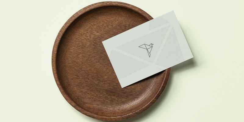
The mark is built from folded geometric forms, precise and considered, which signals competence. But the subject is a dove, which signals peace, resolution, and care. It’s a symbol of hope folded from structure: exactly what Parker Walsh offers its clients. The geometry keeps it from feeling soft or naive. The dove keeps it from feeling cold. The mark isn’t just a logo, it’s an attitude. Every other decision, from the colour palette to the tone of the website copy, followed from the same idea: serious enough to be trusted, human enough to be approached.

What We Made
Mark. Brand. Web. Print.
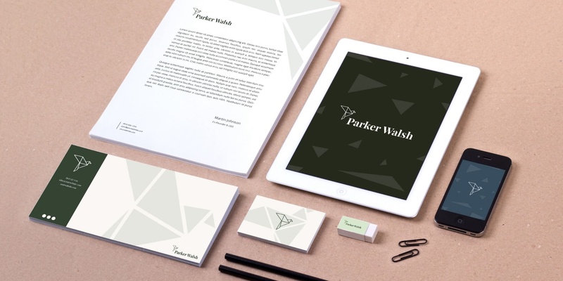
The logo went through several iterations before landing on the final folded dove form. The priority throughout was balance. The mark needed to hold up on a business card at small sizes and on a website header, without losing the detail that makes it read as intentional rather than generic. The final version works in colour, mono, and reversed, and is accompanied by clear space rules and usage guidance so the brand stays consistent as Parker Walsh grows.
The colour palette was deliberately chosen to depart from the sector defaults. Rather than navy and grey, Parker Walsh’s brand uses a palette that feels grounded and trustworthy without defaulting to cold professionalism. The typography follows suit, authoritative but approachable, with enough personality to feel like a real person’s business rather than a faceless institution.
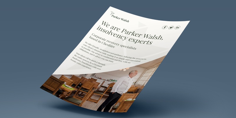
The website was built to match the brand’s tone: clear information architecture, copy that speaks directly to someone in a difficult situation, and a visual system that feels calm rather than pressured. Print collateral, including business cards, letterhead, and supporting stationery, completed the suite, giving Molly everything she needed to walk into her first client meeting looking like an established firm.


What Changed
Launched looking like a firm that had been operating for years.
Molly went from no brand to a complete, coherent identity, one that could hold its own against established players in the sector from day one. The dove mark, the website, and the print collateral all worked together as a system, which meant Parker Walsh didn’t look like a startup. It looked like a practice with a point of view.
In a sector where most firms are indistinguishable from one another, having a brand that actually says something and says it consistently is a genuine competitive advantage. Five years on, Parker Walsh is still trading under the same identity, with a team that has grown since launch. The brand didn’t just survive the business growing. It grew with it. That’s the real test of whether an identity was built properly in the first place.
“Greg created something that immediately set Parker Walsh apart. In a sector where every firm looks the same, we launched with an identity that people actually noticed and commented on. Incredibly creative, and he knows exactly how to translate what you’re thinking into something that works for your clients.”
Molly Monks
Parker Walsh
Let's have a conversation.
A clarity call is a free 30-minute conversation. No pitch, no pressure. Just a straight answer about what you need and whether I’m the right person to help.
Book a free clarity call