
The International Association for Forensic and Legal Linguistics
A global academic association that had outgrown its own image.
The International Association for Forensic and Legal Linguistics brings together researchers, academics, and practitioners from across the world who work at the intersection of language and the law. When they came to me, their brand and website didn’t come close to reflecting the standing of the organisation. That’s what we set out to fix.

Where we started
A serious organisation that didn't look like one.
The IAFLL is a genuinely significant body in its field, an international membership organisation that hosts biennial conferences, publishes a journal, and connects forensic linguistics professionals across the globe. Its members include leading academics, expert witnesses, and legal practitioners working on cases where language is evidence. The organisation carries real weight in its discipline.
The website and brand didn’t reflect any of that. Both were outdated and amateur-looking, the kind of digital presence that might be forgivable for a small local club, but that actively undermines credibility for an international association asking researchers and institutions to take it seriously. In academic and legal circles, how an organisation presents itself matters. A poor website signals poor organisation.
The brief from David Wright was a complete rebrand from top to bottom, new logo, new visual identity, new website. Nothing from the existing brand would carry forward. The starting point was a blank page and a clear goal: make the IAFLL look like the organisation it actually is.
The decision
Credibility without coldness.
The obvious direction for a legal institution is dark colours, serif typefaces, the visual language of law firms and university crests. It signals authority, which is what institutions tend to reach for when they want to be taken seriously. The problem is that it also signals distance, and an international membership association depends on people wanting to join it, attend its conferences, and engage with its community.
The insight was that IAFLL needed to project two things simultaneously: the intellectual rigour its subject matter demands, and the openness of a community that genuinely welcomes new members from anywhere in the world. Those two things can pull in opposite directions visually if you’re not careful. Get it wrong and you end up with something that feels either like a government department or a hobby club, and neither is right.
The identity we built lands between those extremes. The logo is considered and precise, clean geometry that carries academic weight without being intimidating. The colour palette and typography bring warmth and approachability, keeping the brand from tipping into cold formality. The result is a brand that a first-year PhD student and a senior expert witness can both look at and feel this organisation is for them.
What We Made
Identity. Website. Membership platform.
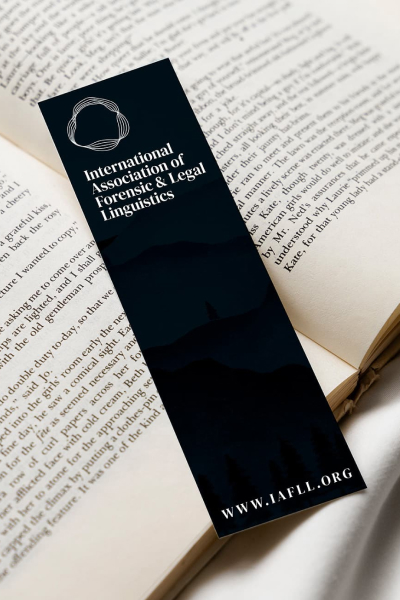
The new logo and visual identity gave IAFLL a consistent, professional face for the first time, one that works across the website, conference materials, publications, and digital communications. The brand system covers the logo in its variations, colour palette, and typography, giving the organisation’s officers the tools to maintain consistency without needing a designer for every application.
The website was built on WordPress, structured around the organisation’s core functions: membership, conferences, news, and resources. The membership functionality, joining, account management, and renewals, is handled through a third-party plugin integrated into the site, keeping the technical overhead manageable for a volunteer-run organisation while giving members a clean, functional experience. The members-only section gives registered users access to content not available to the general public.
The design throughout prioritises clarity. Academic audiences are not short of complex information to read; the website’s job is to make the important things easy to find and the organisation easy to trust. Clean layouts, clear hierarchy, and a considered use of the brand’s visual system do that without drawing attention to themselves.



What Changed
The IAFLL now looks like the organisation it is.
The rebrand gave the IAFLL a coherent, credible identity for the first time, one that holds up whether someone encounters it through the website, a conference announcement, or a journal reference. For a membership organisation, that consistency matters: it builds the kind of institutional confidence that makes people want to join, attend, and participate.
The website gives members and prospective members a clear, functional home, with conference listings, news, resources, and membership management all working together in one place. For a volunteer-run international association, having a site that operates reliably without constant intervention is as important as how it looks.
31.2%
Increase in organic traffic
15.6%
Increase in new memberships
24.9%
Increase in membership retention
Let's have a conversation.
A clarity call is a free 30-minute conversation. No pitch, no pressure. Just a straight answer about what you need and whether I’m the right person to help.
Book a free clarity call